2021. 10. 15. 18:40ㆍHTML + CSS + JS
1. 트랜지션 transition
트랜지션은 웹 요쇠의 배경색을 바꾸거나 도형의 테두리를 사각형에서 원형으로 밖는 것처럼 스타일의 속성이 바뀌는 것을 말한다.
웹 요소의 스타일 속성이 시간에 따라 바뀌는 것을 트랜지션이라고 한다.
2. transtion-property
transition-property 속성은 트랜지션 대상을 지정하는 속성이다.
1️⃣ all : 모든 속성이 트랜지션 대상이 된다. 기본값
2️⃣ none : 트랜지션을 하는 동안 아무 속성도 바뀌지 않는다.
3️⃣ 속성 이름 : 트랜지션 효과를 적용할 속성을 지정한다.
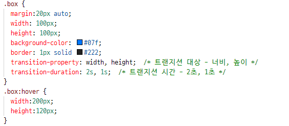
3. transition-duration
transition-duration은 transtion-property 에서 트랜지션 대상을 지정했다면 다음으로 진행 시간을 지정해야 속성이 자연스럽게 바뀌는 애니메이션 효과를 만들 수 있다.
지정할 수 있는 단위는 초 또는 밀리초이다.
트랜지션 대상 속성이 여러개 라면 진행 시간도 쉼표로 구분해서 여러개 지정할 수 있다.
transition-duration : 시간

4. transition-timing-function
transition-timing-function 속성은 트랜지션 속도 곡선을 지정하는 속성이다.
이 속성을 사용하면 트랜지션 효과의 시작,중간, 끝에서 속도를 지정해 전체 속도 곡선을 만들 수 있다.
1️⃣ ease : 처음에는 천천히 시작하고 점점 빨라지다가 마지막엔 천천히 끝낸다. 기본값
2️⃣ linear: 시작부터 끝까지 똑같은 속도로 진행한다.
3️⃣ ease-in : 느리게 시작한다.
4️⃣ ease-out: 느리게 끝낸다.
5️⃣ ease-in-out : 느리게 시작하고 느리게 끝낸다.
6️⃣ cubic-bezier(n, n, n, n) : 배지에 함수를 정의해서 사용한다. 이때 n 값은 0~1 사이만 사용할 수 있다.
5. transition-delay
transition-delay 속성은 트랜지션 효과를 언제부터 시작할 것인지 설정한다.
이 속성을 사용하면 지정한 시간만큼 기다렸다가 트랜지션이 시작됨.
transition-delay : 시간
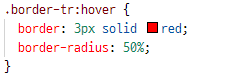
* 연습문제 1

html
<!DOCTYPE html>
<html lang="ko">
<head>
  <meta charset="UTF-8">
	<meta name="viewport" content="width=device-width, initial-scale=1">
  <title>CSS3 애니메이션</title>
  <link rel="stylesheet" href="css/product.css">
</head>
<body>
	<div id="container">
    <h1>신상품 목록</h1>
		<ul class="prod-list">
      <li>
        <img src="images/prod1.jpg">
        <div class="caption">
          <h2>상품 1</h2>
          <p>상품 1 설명 텍스트</p>
          <p>가격 : 12,345원</p>
        </div>
      </li>
      <li>
        <img src="images/prod2.jpg">
        <div class="caption">
          <h2>상품 2</h2>
          <p>상품 2 설명 텍스트</p>
          <p>가격 : 12,345원</p>
        </div>
      </li>
      <li>
        <img src="images/prod3.jpg">
        <div class="caption">
          <h2>상품 3</h2>
          <p>상품 3 설명 텍스트</p>
          <p>가격 : 12,345원</p>
        </div>
      </li>
    </ul>
	</div>
</body>
</html>
CSS
#container {
width:1000px;
margin:20px auto;
}
h1 {
text-align:center;
}
.prod-list {
list-style:none;
padding:0;
}
.prod-list li {
float: left;
padding: 0;
margin: 10px;
overflow: hidden;
position: relative;
}
.prod-list img {
margin:0;
padding:0;
float:left;
z-index:5;
}
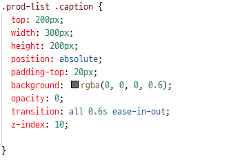
.prod-list .caption {
top: 200px;
width: 300px;
height: 200px;
position: absolute;
padding-top: 20px;
background: rgba(0, 0, 0, 0.6);
opacity: 0;
transition: all 0.6s ease-in-out;
z-index: 10;
}
.prod-list li:hover .caption {
opacity: 1;
transform : translateY(-200px);
}
.prod-list .caption h2, .prod-list .caption p {
color: #fff;
text-align: center;
}
'HTML + CSS + JS' 카테고리의 다른 글
| 9-4. CSS 트랜지션과 애니메이션 연습문제 1,2 (0) | 2021.10.15 |
|---|---|
| 9-3. CSS 애니메이션 사용하기 (animation,@keyframs, animation-duration, ..) (0) | 2021.10.15 |
| 9-1. CSS 변형 (transform, translate(), scale(), rotate(), skew()) (0) | 2021.10.15 |
| 8-4. CSS 고급선택자 연습문제 1,2 (0) | 2021.10.15 |
| 8-3. CSS 가상 클래스와 가상 요소 (0) | 2021.10.15 |